Introduction
AWS has been the leading cloud provider for over a decade now. In Q2 2025, they hold around 30% of the global market, ahead of Microsoft Azure at 20% and Google Cloud at 13%. Many software companies use AWS as their cloud provider for deploying their infrastructure. Software architects at these companies use AWS diagrams to design their architecture, serving as a reference for engineering discussions and stakeholder meetings. However, AWS diagrams aren’t always practical and often fall short as a reliable form of software documentation. Even when used in documentation, different audiences like developers, product managers, and data analysts struggle to view the architecture at the level of detail they need.
Let’s look at three reasons why 👇
Intro
Suppose you’re designing a simple web app for a customer project. You go for a serverless architecture to avoid the operational overhead of managing servers, and you can scale it up or down based on user traffic. Simple, right? But as soon as the architecture grows in complexity (e.g., adding more services, third-party integrations, and user flows), the diagrams quickly become harder to manage and interpret.
Using an AWS diagram for the web app makes sense here. The architecture is simple, everything is deployed on AWS, and the design does not need extra layers of abstraction to explain.
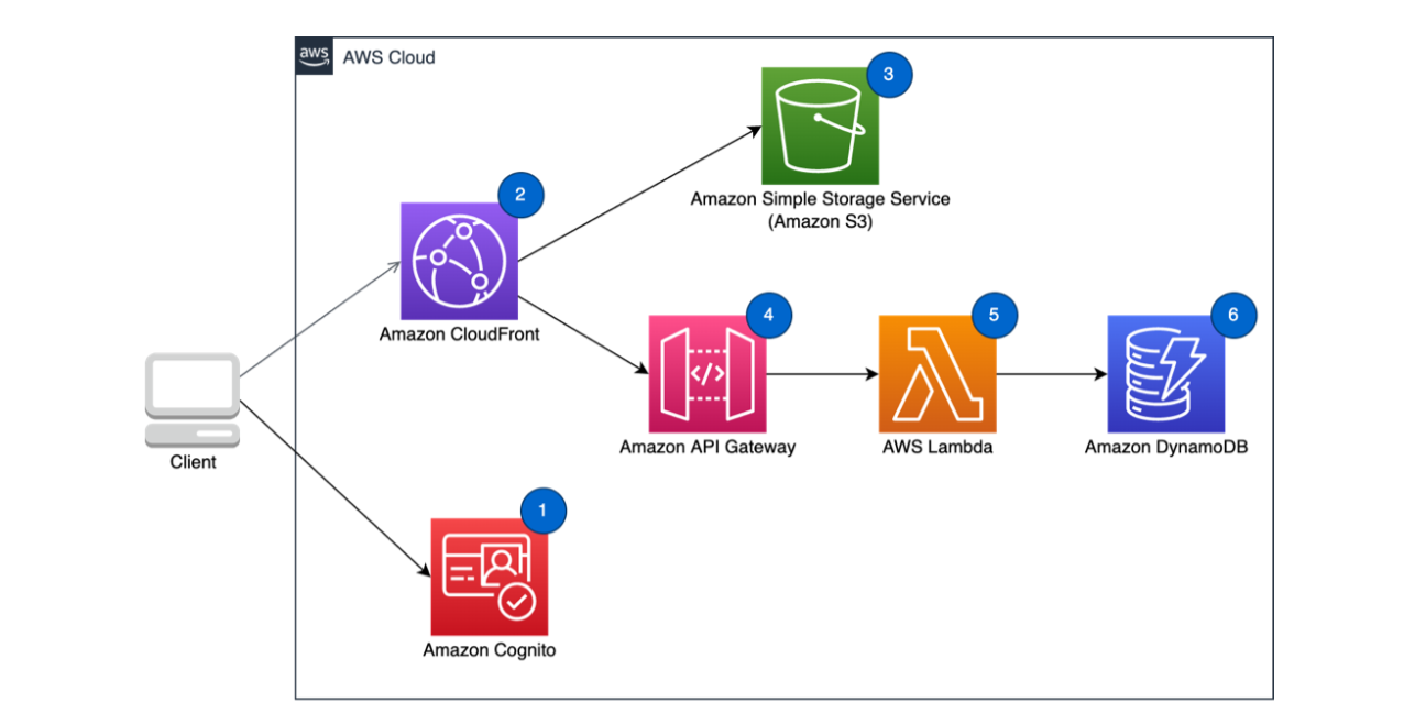
source: https://docs.aws.amazon.com/wellarchitected/latest/serverless-applications-lens/web-application.html
Now what if we’re designing a more complicated architecture, say an event-driven architecture for ingesting and analysing customer documents? The diagram would look something like this.
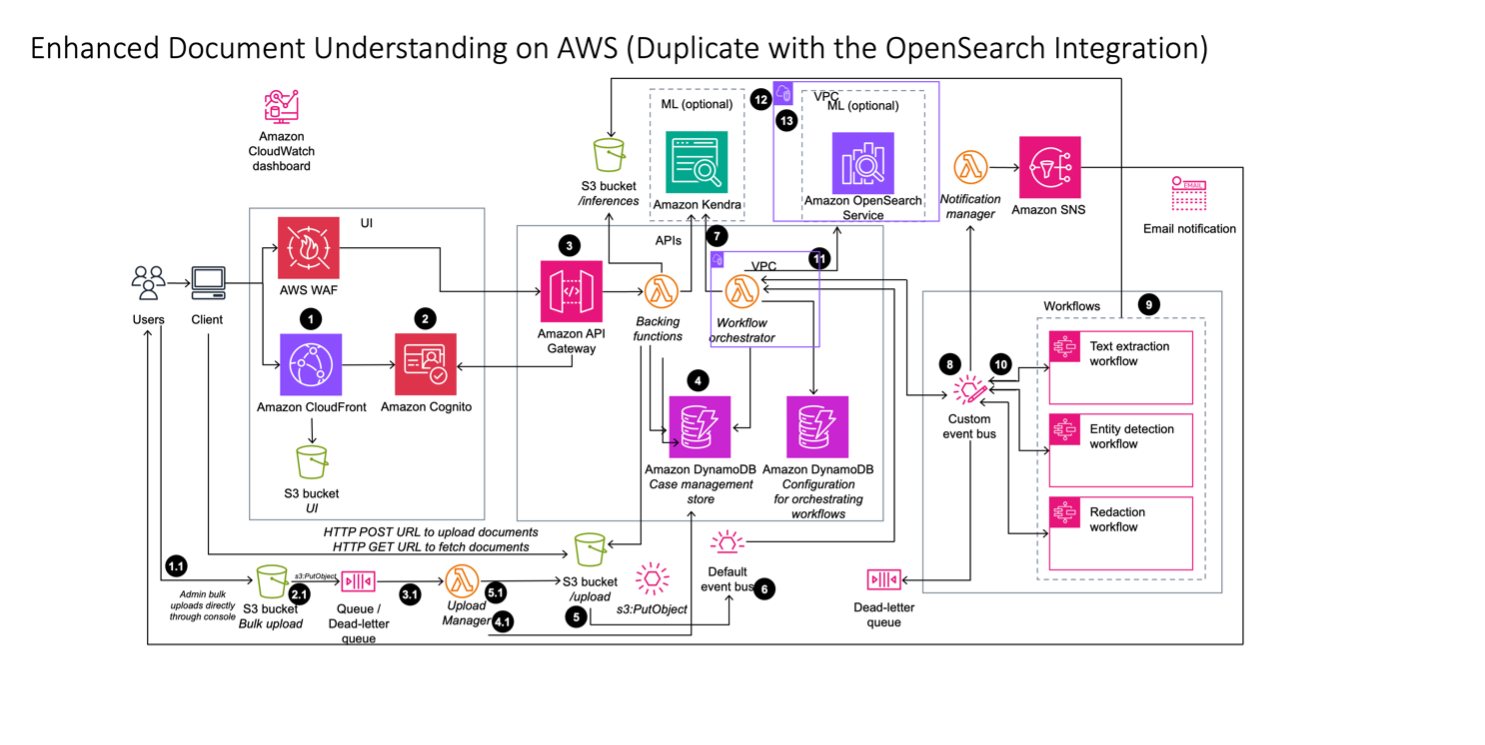
Unless you’re an AWS solutions architect, you won’t be able to quickly interpret this architecture or understand the flow of the system. Audiences like developers, product managers, and designers will struggle to read it, mainly because of the minimal categorisation, lack of structure, unfamiliar abstractions, and heavy use of icons. More importantly, what really matters is the categorisation and abstraction.
🤷 Why They Don’t Work
AWS diagrams don’t work for three main reasons:
- Limited abstraction: only a single layer of detail.
- Vendor lock-in: not great for multi-cloud.
- Static by nature: diagrams quickly become outdated.
Let’s unpack each one.
🕸️ 1. Single Layer of Abstraction
AWS diagrams are good for showing all the services in one view. They provide a bird’s-eye view of the architecture and the technologies used for deployment (e.g., PostgreSQL, Redis). Software architects usually design these diagrams, but engineers are limited in how much detail they can add. For example: what services do these teams own, how are they implemented (e.g., REST APIs, GraphQL), what other services do they interact with, and what the source code looks like that implements these services.
An AWS diagram does not answer these questions. It only shows one level of abstraction: infrastructure.
For engineering teams that need to collaborate and communicate their work at different levels with different audiences (e.g., product managers, designers, data scientists), an AWS diagram is only useful for software architects or engineers working solely in AWS environments. Beyond that, it doesn’t work.
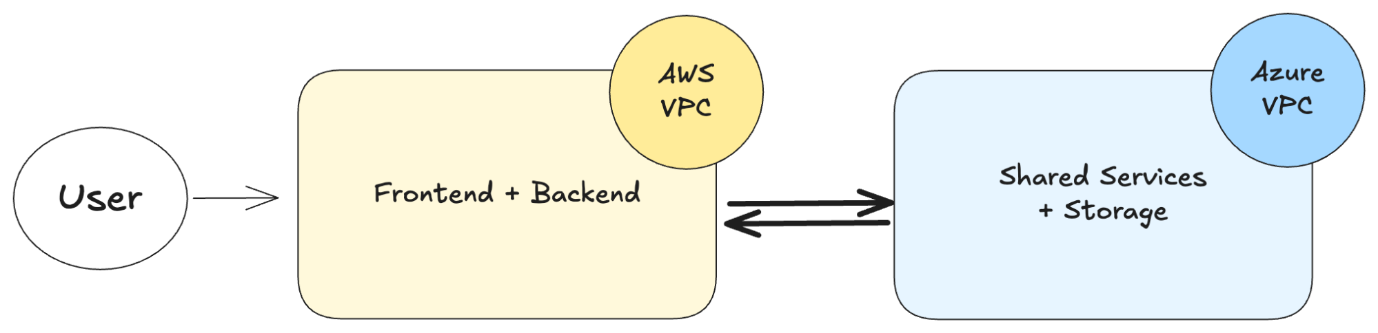
🔒 2. Vendor Lock-In: Not great for multi-cloud
AWS has invested in its ecosystem by introducing the Architecture Center for system design and the Architecture Icons kit to simplify diagramming via templates and icons. Tools like Draw.io, Miro, and Lucid are common examples used with these icons.
However, engineering teams that deploy software across multiple cloud providers (e.g., Azure, GCP, AWS) usually aim to replicate their architecture using commoditised services. In this context, drawing architectures with AWS-specific icons or patterns can be confusing when the goal is to explain a cloud-agnostic design. This is known as multi-cloud, where your architecture runs on more than one cloud provider.
⌛️ 3. Static by nature
AWS diagrams are often created during the initial design phase and then largely forgotten. If the diagramming tools don’t make it easy to update architectural diagrams, it becomes difficult to maintain an accurate reference architecture. While AWS diagrams provide a snapshot of the high-level architecture, they fail to capture other layers of abstraction that engineers and other stakeholders also care about. In complex systems, it’s easy to get lost in the details when working with a single-view diagram. That’s why having a framework like the C4 model can help.
🌟 How Can The C4 Model Help
The C4 model is a set of hierarchical abstractions that describe software architecture using simple graphical notation. Rather than relying on a single abstraction, like traditional AWS diagrams, the C4 model offers a multi-layered approach for visualising software architecture. It breaks a system down into four views: Context, Container, Component, and Code, making it easier for teams to view and maintain an accurate representation of their systems.
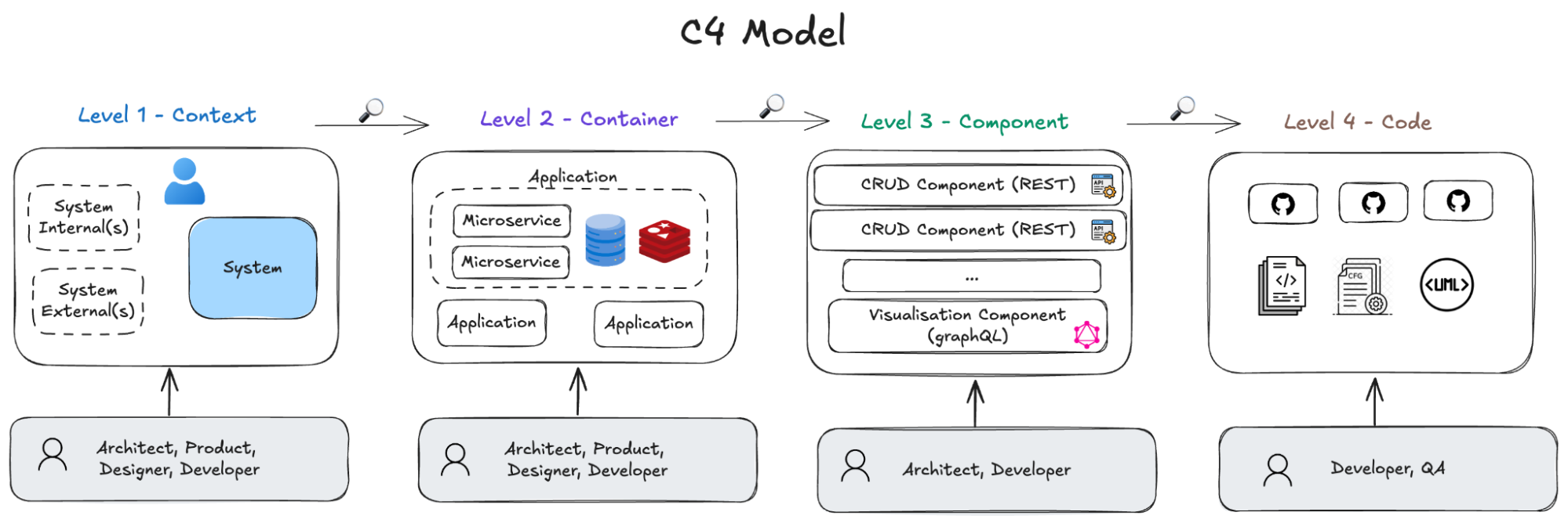
If you’d like to try the C4 model yourself, sign up for free on IcePanel to get started.
🏁 Wrap Up
AWS diagrams can be useful for documenting some software architectures. However, they often fall short as a reliable source of truth for systems that change frequently, span multiple cloud providers (e.g., multi-cloud environments), or require multiple layers of abstraction. By contrast, the C4 model provides a hierarchical approach to visualise software architecture with simple notations. Teams can create diagrams that remain accurate, up-to-date, and understandable for all stakeholders, whether engineers, architects, product managers, designers, or customers.
