⚡️ TL;DR
- With the ubiquity of ‘big data,’ modern systems have evolved to acquire, process, and store vast amounts of data.
- Systems rely on data pipelines, which vary in design, to utilize the data effectively. Understanding the architecture of these pipelines is just as important as understanding application architecture.
- With the C4 model and IcePanel, you can create rich visualizations of your data pipeline so everyone, from data scientists to architects and product managers, can understand how things work.
📖 Overview
‘Big data’ is now a commonly understood phenomenon, with vast amounts of data being gathered, processed, and stored in most modern software systems. With data becoming an integral part of systems, visualizing its movement (a data pipeline) has become as important as understanding application or infrastructure-level architecture.
We’ve discussed the strengths of the C4 model extensively here and here. The C4 model shines because of its simplicity and flexibility. It’s an effective framework for communicating microservice or event-driven architectures, as well as data pipelines with simple abstractions and hierarchy.
In this guide, we’ll show you how to diagram an ETL pipeline in IcePanel. Let’s dive in!
🔑 Key elements of a data pipeline
A data pipeline is the process of aggregating raw data across many sources, moving it, transforming it, and storing it for business insights or further analysis (AI/ML). These steps are automated, saving time from manual work and processes.
Data pipelines are composed of 3 main things:
- Data sources: These can include anything from application data in an RDBMS to batch data (CSV, JSON files) or streaming data from Kafka.
- Processing or transformation steps: Data from multiple sources are combined and changed based on business rules. The data can be copied, transformed, augmented, filtered, and aggregated.
- Storage: The data is stored in a data warehouse or non-relational database for analysis.
A common data pipeline design is the ETL (extract, transform, load) Pipeline. In this design, data is extracted from sources, manipulated, and then stored. Other data design paradigms include ELT (extract, load, transform) and Streaming ETL.
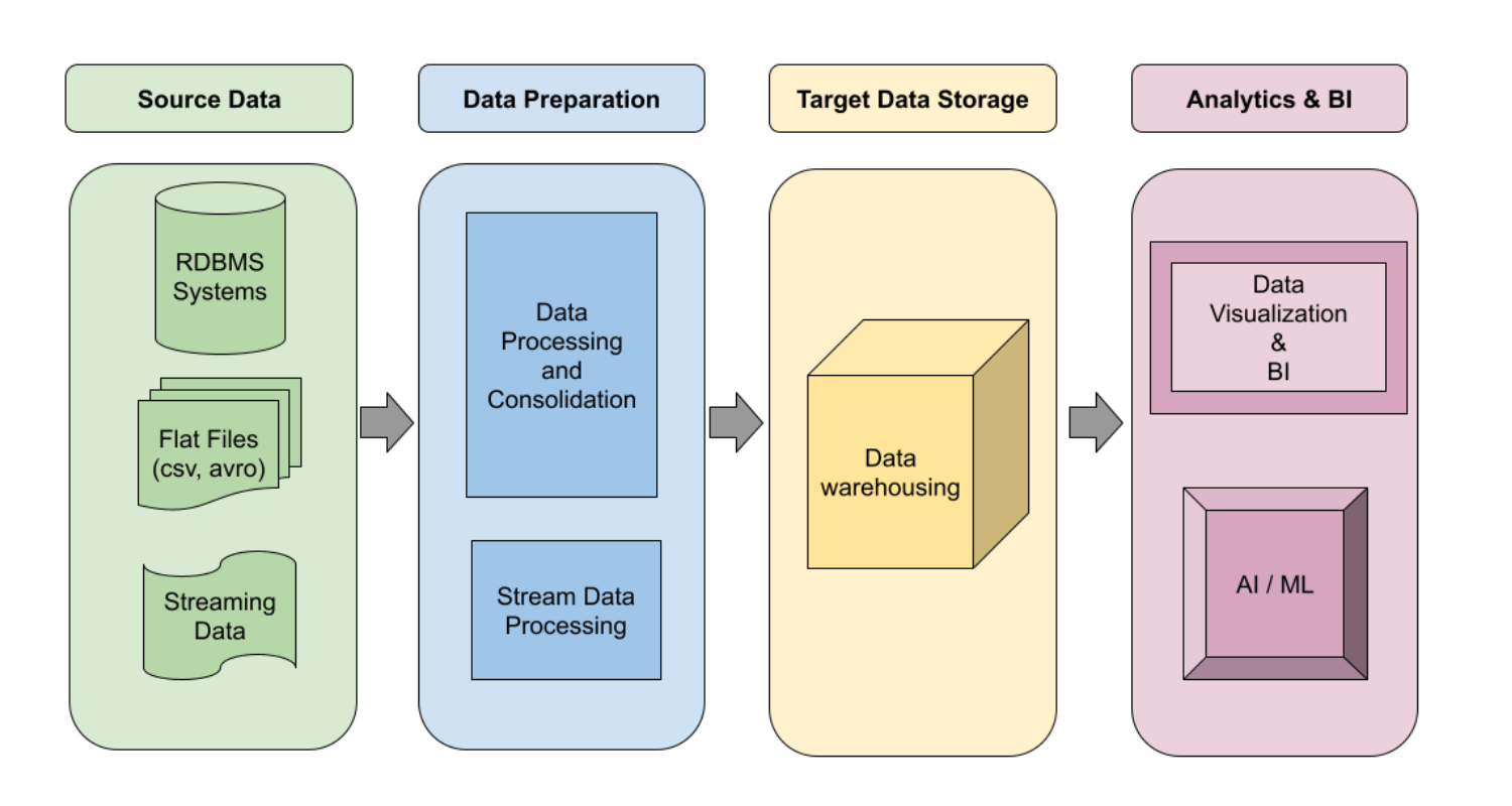
Logical design of a data warehousing pipeline from Google
✍️ How to diagram an ETL pipeline in IcePanel
🏦 Chilly Bank system
The Chilly Bank system is a web and mobile-based application that allows customers to view their account balance, deposit/withdraw money, and send money across the polar region.
Level 1 — Context diagram
The context diagram shows a high-level overview of the Chilly Bank system, actors (customers, revenue agency, employees) and other external systems. Google Analytics and Looker are key external systems to consider later on when we diagram the data pipeline.
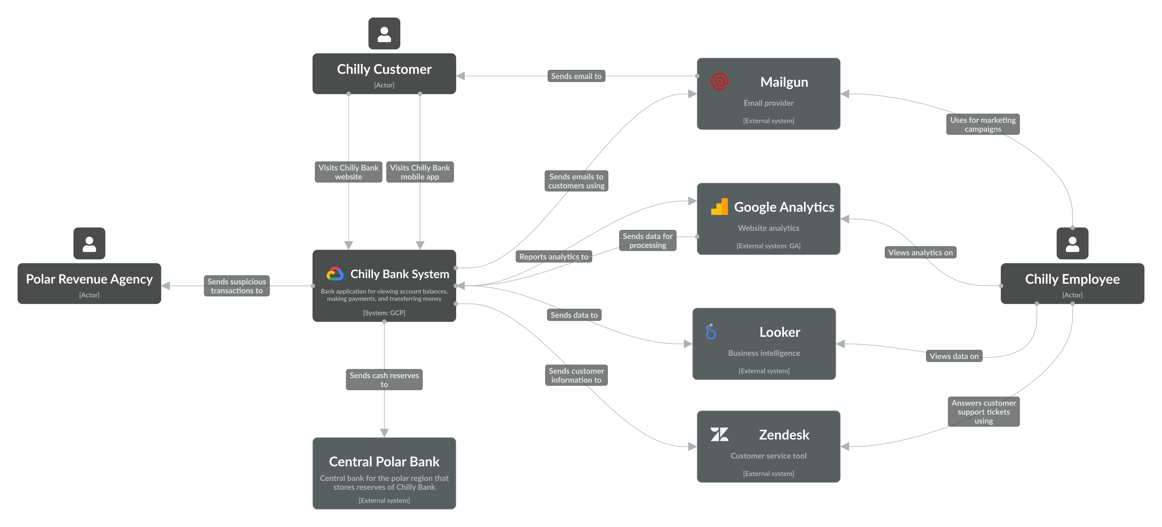
Level 1 diagram of the Chilly Bank system
Level 2 — Container (App) diagram
To start, we created a diagram that focuses on how the banking app works. Account and transaction data are stored in 2 separate databases on Google Cloud SQL.
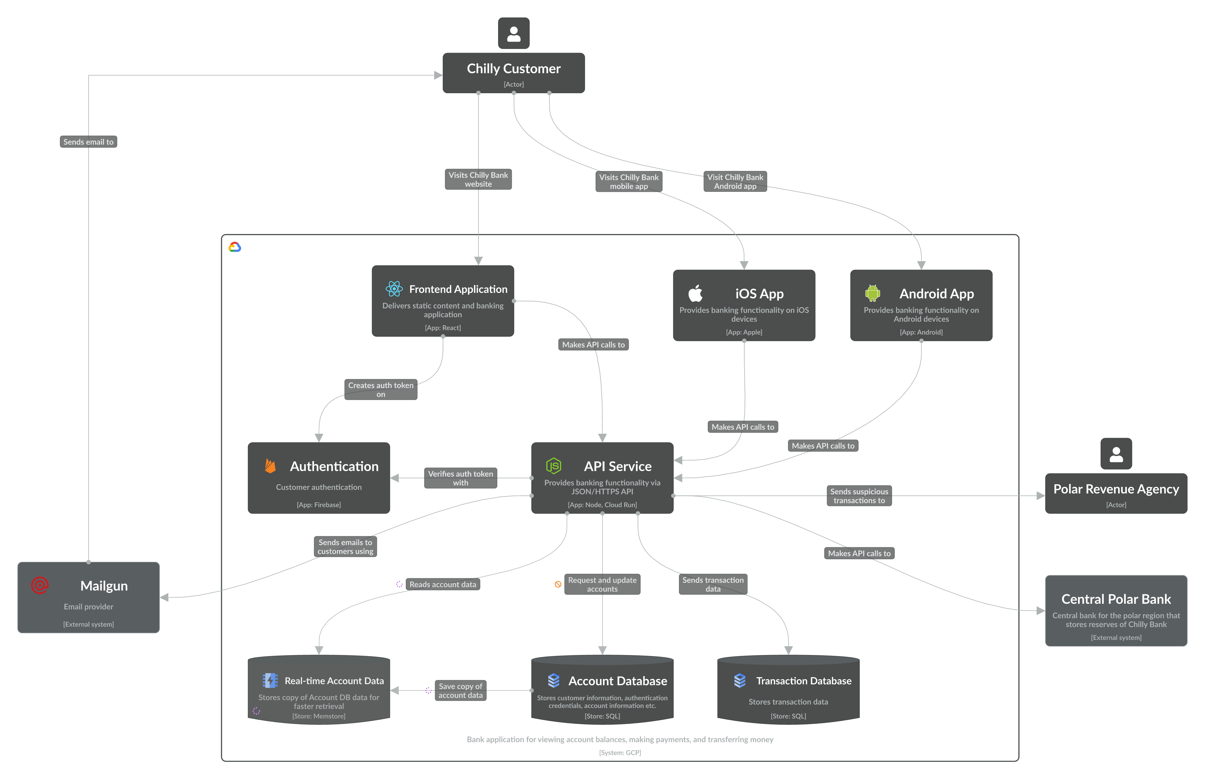
Level 2 app diagram of the Chilly Bank system
We always recommend breaking up diagrams to communicate a specific story, so we’ll create a new one at the same level to show the data pipeline.
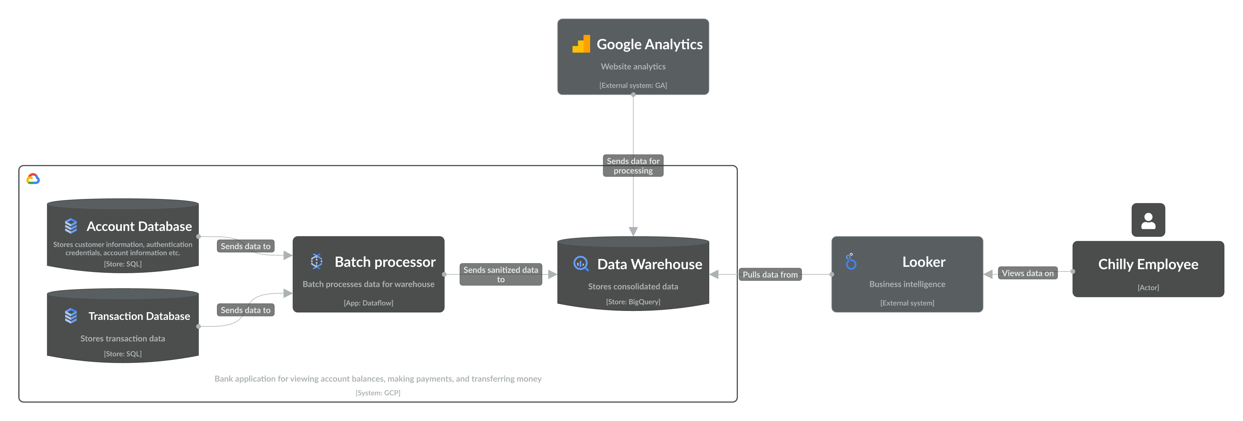
Level 2 app diagram showing the data pipeline of the Chilly Bank system
Data from the Account and Transaction databases are sent to Dataflow, which batch processes it for storage in the BigQuery data warehouse. Google Analytics data is also sent to the warehouse. Lastly, Looker is connected to the BigQuery warehouse, which employees access for insights.
🤔 Internal vs external system?
Now, you might have wondered why Google Analytics and Looker were defined as external systems, while the data warehouse as an internal system. Our general rule of thumb is to think about this in terms of code ownership — do you own the code for the system/app/component, or is it an enabling technology?
Since most stores today are serverless and require less operational maintenance, we recommend defining these as internal systems if they store critical business information.
