
⚡️ TL;DR
In this guide, we explain how to diagram event-driven architectures using the C4 model. We’ll use a practical example from the Architectural Kata 2024 winner and discuss the pros and cons of different ways to represent topics. Let’s dive in!
📖 Overview
Event-driven architectures have become an essential part of modern microservice systems. In these systems, decoupled services communicate through brokers based on events. These events represent updates or state changes passed between services.
Event-driven architectures are composed of several key components:
- Producers — objects that trigger an event
- Brokers or routers — objects that pass information between producers and consumers
- Consumers — objects that receive data from the broker
You might be wondering, how do I create this in the C4 model? Is it even possible? In this guide, we’ll walk you through an example.💡
❤️ StayHealthy Monitor Me system
For this example, we’ll be referencing the winners from the Architectural Kata 2024 winners (BluzBrothers). Competing teams were tasked with designing a hypothetical medical patient monitor system for hospitals. The ‘MonitorMe’ application monitors patient vitals, analyzes them for issues, and notifies medical professionals for emergencies.
1️⃣ Level 1 — Context diagram
This diagram shows the big picture architecture and contains actors and systems.
Actors
- Patient — People whose vitals are being monitored and analyzed by the system.
- Medical professionals — People who monitor patient vitals to deliver care.
Systems
- MonitorMe — The primary system that collects, stores, analyzes and shares vital data.
- StayHealthy — The system medical professionals use to receive notifications on vital data.
- Nurse Station — The system medical professionals use to view vital data.
- MyMedicalData — Cloud-based system that stores patient records securely.
- Sensors — Group of hardware sensors monitoring patient vitals.
Sensors monitor patient vitals and send information to the MonitorMe system. This system interacts with 2 other systems: StayHealthy, which pushes alerts to medical professionals, and Nurse Station, the platform for viewing patient data.
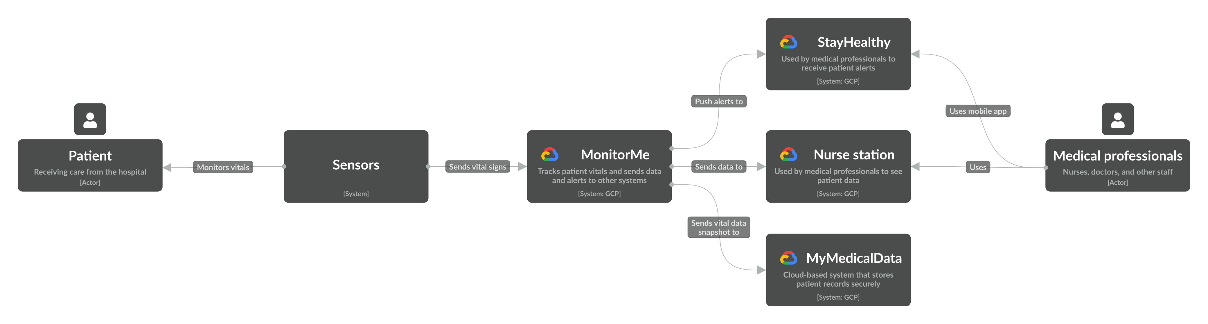
Level 1 context diagram of the MonitorMe system
2️⃣ Level 2 — App (container) diagram of MonitorMe
Drilling into the MonitorMe system, we now focus on the different applications, stores, and related systems. This is where we start including event-driven entities like topics.
Apps
- Vital sign recorder — Consolidates raw sensor data and sends it to the topic.
- Vital sign analyzer — Analyzes vital data to identify abnormalities.
- Patient and sensors API — API for patient and sensor data.
- Vital sign alert service — Notification service for alerts.
- Vital sign streamer — Streams vital signs and alerts to the consolidated screen.
- Mobile app — Medical staff app to receive alerts.
Stores
- Vital data — Saves anonymized vital data by sensor.
- Patient and sensor data — Stores patient and sensor data.
- Signal cache — Stores patient data for quick retrieval during analysis.
- Rules database — Stores predefined rules for anomaly detection.
Topics
We can represent topics in the C4 model as either apps or through connections with a tech choice added. Let’s break them down and talk about the tradeoffs.
Topics as apps
The first way is to represent topics as apps. We don’t recommend representing them as stores since they primarily pass information between different objects. With this method, the topics are much more prominent in the diagram since they appear visually identical to an app. You also benefit from having the topics in the model to filter on or view its dependencies in IcePanel.
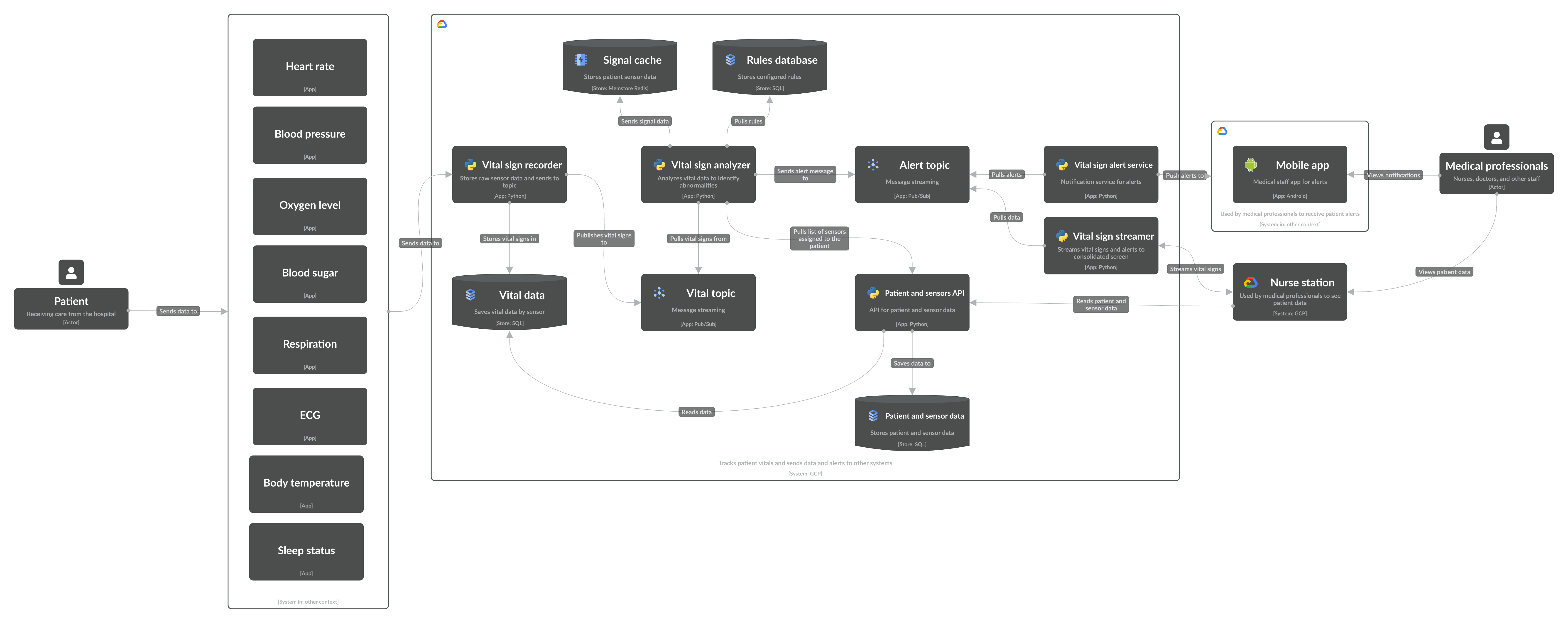
Level 2 app diagram of the MonitorMe system with topics as apps
The downside to this approach is when you have many producers and consumers going through a broker. This leads to a hub-and-spoke design, with many connections going through a single object (not pretty). You also lose the ability to model the connection between the producer and consumer, which may be helpful information to keep track of. In this scenario, you may want to consider the second option.
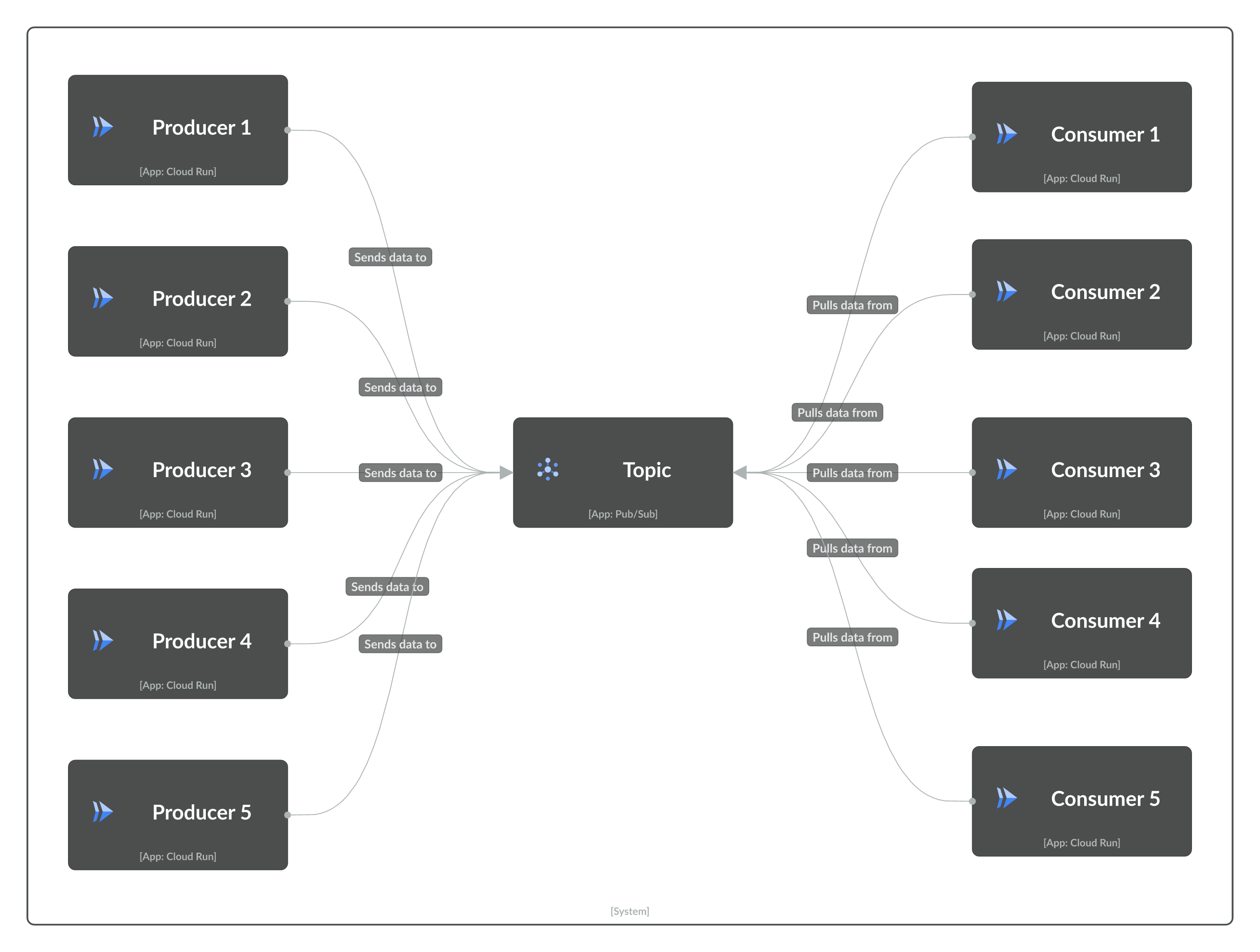
Hub and spoke design when representing a topic as an app
Topics as connections with a tech choice
Instead of showing topics as apps, you can draw a connection between the producer and consumer with a tech choice for the broker (e.g. Kafka, Google Pub/Sub). You no longer have to deal with a hub-and-spoke design in the diagram, with the transport layer less visible.
The tradeoff with this approach is the loss of topic information in the model. Technically, these connections still exist in the model, but it’s harder to view topic dependencies. We’re considering ways to expand the filtering and dependency view to address this gap.
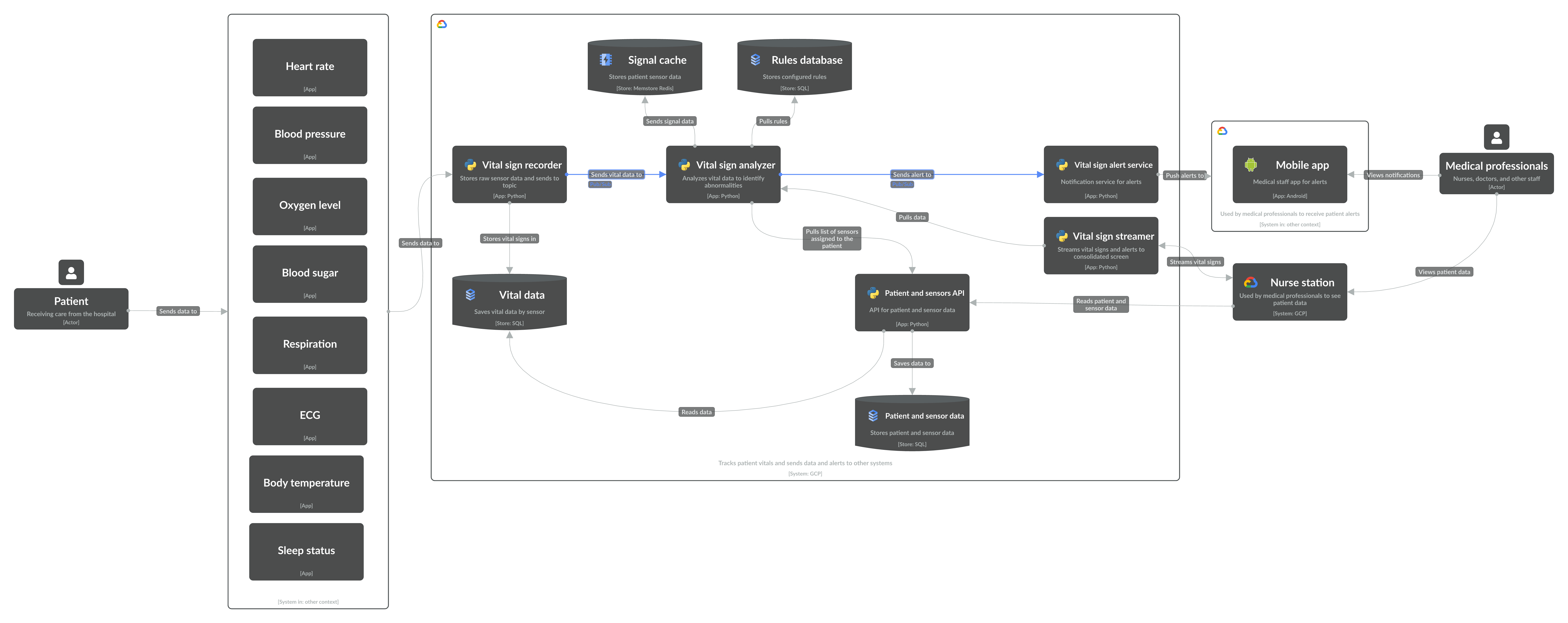
Topics as connections with Cloud Pub/Sub tech choice pinned
3️⃣ Level 3 — Component diagram of Vital sign analyzer
Zooming into the Vital sign analyzer, we now diagram the logical groupings of code inside of the app. If it’s a store, we can highlight relevant information like tables.
Components
- Vital signs topic subscriber — Pulls data from the topic and sends it to the signal normalizer for analysis.
- Signal normalizer — Matches signal data with the patient and doctor. Passes data to the logic processor.
- Patient and sensor provider — Stores and retrieves patient data.
- Logic processor for rule engine — Detects anomalies from signal data and sends notifications.
- Alert publisher — Sends an alert to the alert topic.
- Rule engine — CRUD for anomaly detection based on rules.
There will be slight variations in the Level 3 diagram depending on how you visualize topics. If you create apps for topics, they’ll appear outside of the primary app and be connected to the respective components. If you instead represented the topics as connections, you’ll add the related apps the topic is connected to in Level 3.
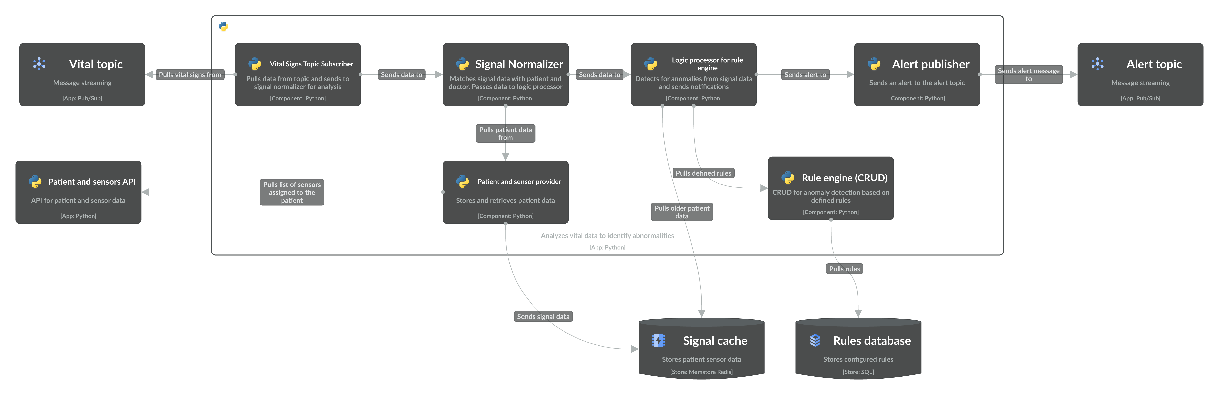
Level 3 component diagram of the Vital analyzer app with topics as apps
4️⃣ Final thoughts
In this guide, we walked through how to diagram event-driven architectures using the C4 model with a practical example from the MonitorMe system. We discussed the different levels from context to component diagrams and the pros and cons of representing topics as either apps or connections. In our next guide, we’ll talk about to visualize deployment diagrams in IcePanel. Stay chill for now! ❄️
